

How to Prepare Artwork for Print
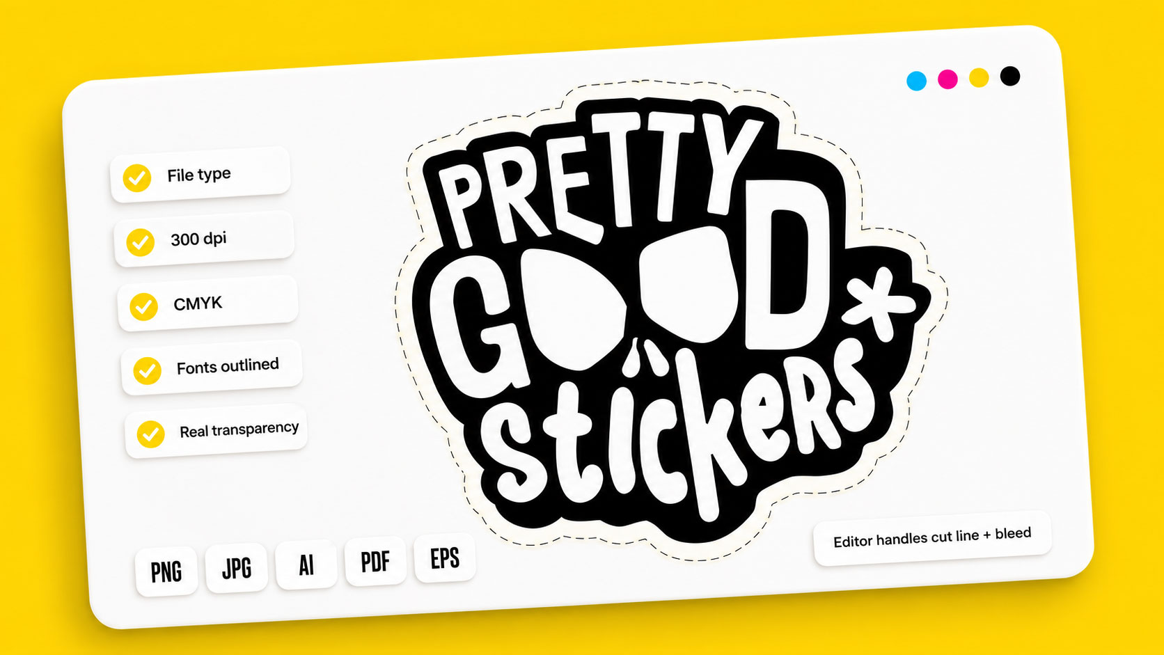
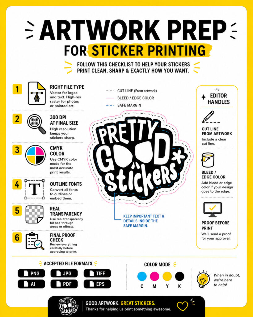
Print-ready is less work than it sounds, because the editor handles some of the hardest parts for you. What’s on you: the right file type, enough resolution, and CMYK color. What the editor manages: bleed, edge color, and the cut line, which it traces from your artwork automatically. A well-prepared file still gives a better result than a raw one, so knowing both halves is worth it. This guide covers what to check and what’s already handled.
Start with the file, then the resolution
Two of these have their own deep-dive posts, so here’s the short version with pointers.
File type: vector for logos, text, and clean line work; high-resolution raster for anything painted or photographic. The editor accepts PNG, JPG, TIFF, AI, PDF, and EPS. Which to use when is covered in full in the file type guide.
Resolution: raster artwork needs 300 dpi at the final print size, not before it’s enlarged. It’s the most common cause of a soft print, and the blurry stickers post covers why.
These two are entirely on you. The editor can’t fix a low-resolution file or convert a bad format into a good one, so this is where good prep pays off most.
Color: design in CMYK, or expect a shift
Stickers print in CMYK; screens display in RGB. Design in RGB without converting, and vivid blues, greens, and neons can come out more muted at print than they looked on screen.
Set your document to CMYK before you start, so what you see while designing is closer to what prints. If a file’s already RGB, converting before upload lets you catch any shift yourself instead of meeting it at the proof. For a brand color that has to land exactly, flag it with support rather than trusting the conversion.
Bleed and edge color: the editor covers it, prep still helps
Bleed is artwork extended past the cut, so a slight shift in cutting never leaves a thin unprinted sliver at the edge. The editor adds a related edge color automatically to cover any potential gap, and you can change that color if the default doesn’t suit your design.
That safety net doesn’t mean prep is pointless. If your design runs edge to edge and you’ve built in your own bleed, you control exactly what shows at the boundary rather than leaving it to an auto-added color. If you haven’t, the editor still protects you. Either way you’re covered, but a file prepared with its own bleed gives you the final say on the edge.
As a rough sense of scale: heavily overdone, 5mm of bleed is generous, and most stickers need less. The right amount scales with the sticker size, which is exactly why a fixed number guessed into your file is less reliable than building bleed proportional to your design, or letting the editor handle it.
Safe margin: the call only you can make
The editor manages the outer edge, but it can’t know which parts of your design are critical. Keep text, logos, and anything that must not be clipped set inward from the cut rather than against it. On a small sticker this matters more, because there’s less room to absorb any cutting shift.
This is the one edge decision no tool can make for you: it protects the outer boundary automatically, but deciding what’s important enough to keep safely inside is yours.
Cut line: the editor traces it, you fine-tune it
For die-cut and custom shapes, the cut line is the sticker’s outline, and this is what the editor is built around. Upload your artwork and it traces the shape and adds the cut line automatically. A slider then lets you pull the cut tighter to your design or give it more breathing room, which is more direct control over the cut than most sticker printers offer.
So you don’t need to draw a closed path or set up a separate cut layer. That said, cleaner artwork traces better: a design with a clear silhouette and real transparency (not a white background pretending to be transparent) gives the auto-trace a cleaner edge to follow than a busy or boxed-in file. The tool does the work, and a tidy file makes its work sharper.
The small things that cause delays
A few file habits catch people out even when the basics are right:
- Fonts not outlined. If a font isn’t converted to outlines or embedded, it can reflow or substitute elsewhere. Outlining locks it in place.
- A “vector” PDF with a raster image inside. Vector-shaped file, low-resolution artwork within, prints soft anyway. Check what’s inside, not just the extension.
- Hidden layers or stray elements. Leftover off-canvas objects can behave unexpectedly. Clean up before export.
- A white background mistaken for transparency. If the design needs a transparent background, the file has to already have one, which also helps the cut-line trace.
What we recommend
Get the parts that are yours right: correct file type, 300 dpi at final size, CMYK color, outlined fonts, real transparency. Build in your own bleed if you want control of the edge, and keep critical detail inside a safe margin. Then let the editor trace the cut and cover the bleed, and use the proof to check the result. The tool handles a lot, and a clean file makes everything it handles come out better.
When to contact support
Reach out before approving if you’re unsure whether a color will hold, whether a detailed design will survive at your chosen size, or whether the cut line is sitting where you want it. Quicker to sort before production than after.
FAQ
What does “print-ready” mean for stickers?
A file that’s the right type, 300 dpi at final size, and in CMYK, with critical detail kept inside a safe margin. Bleed and the cut line are handled by the editor, though a file with its own bleed gives you more control of the edge.
Do I need to add bleed myself?
Not necessarily. The editor adds an edge color to cover any gap automatically. Building your own bleed is worth it only if you want to control exactly what shows at the very edge.
Do I set up the cut line?
No. The editor traces your artwork and adds the cut line automatically, and a slider lets you adjust how tight it sits. Cleaner artwork with real transparency traces more precisely.
Why design in CMYK instead of RGB?
Stickers print in CMYK. Designing in RGB means colors convert at print, and vivid ones can come out muted. Working in CMYK shows you the real colors as you design.
Why outline fonts before printing?
An un-outlined font can substitute or reflow if it’s unavailable where the file is processed. Outlining converts text to shapes so it prints exactly as designed.
What most often delays a sticker order?
Low resolution at the final size, and files that look vector but contain a low-res image. Both surface at proofing and cost a round of revision.
 Staff
Staff