

Matte vs Glossy Stickers
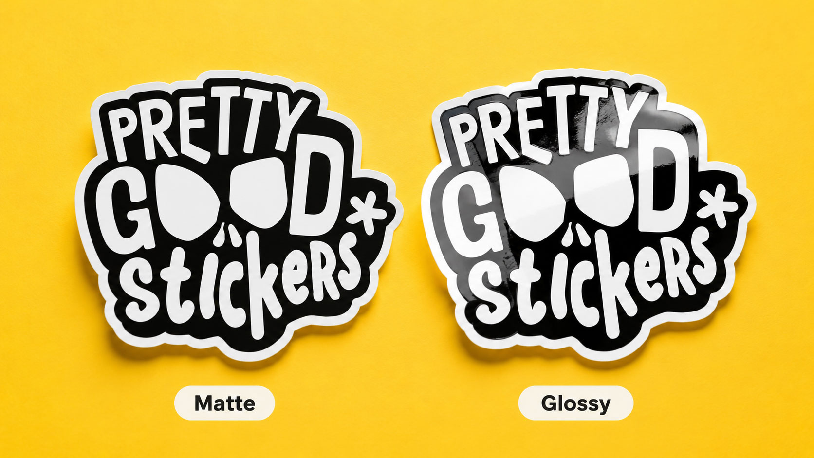
Both our matte and glossy stickers start from the same premium waterproof vinyl, and both get laminated for UV protection and scratch resistance. The laminate is different, one gives a glossy finish, one matte, but they’re rated the same for durability: both outdoor-suitable, both waterproof, both built to last. So the usual “which one survives longer” question doesn’t decide anything here. The choice is purely how each finish handles light, and that one difference shapes everything you actually care about.
Color: how much punch do you want
Glossy reflects light, and that reflection deepens your colors. Reds go louder, blacks go richer, gradients read smoother. If your design lives on saturation, gloss makes it work harder.
Matte scatters light instead, so the same colors come back a touch softer, with a flatter, art-print quality. Nothing’s lost, it’s a different register. A vivid graphic gains energy on gloss; a muted illustration gains a considered, printed-on-good-paper feel on matte.
The trap is assuming one is objectively better. A neon design on matte looks flat, not refined. A soft pastel on gloss can look cheaper, not punchier. The finish either matches the artwork’s intent or fights it.
Glare: where will people actually see it
This is where the finishes genuinely split. Gloss throws light back, so under a lamp, in a shop, or in a product photo, parts of the design can vanish into a bright hot spot. Matte returns almost no glare from any angle.
That decides where each belongs. A sticker photographed for a shop listing or a social feed wants matte, no glare to fight in the shot. A sticker meant to catch the eye on a shelf or a bumper can want gloss, the shine is doing promotional work there. Ask where it gets seen before picking, not just what colors it has.
Legibility: is there text or fine detail
Text and gloss are an awkward pair. The reflectivity that deepens color also bounces light across words at the wrong angle, and a line of text can drop into a glare streak right when someone’s trying to read it. Matte holds text legible from every angle because there’s no reflection to interrupt it.
For anything text-heavy, a label, packaging with instructions, a typographic design, matte is usually the safer read. Gloss suits designs where the image leads and any text is large.
Handling: will it get touched
Gloss shows fingerprints and smudges, most visibly on dark colors. Matte mostly swallows them into its surface, along with dust and minor marks. If the sticker lives somewhere it gets handled, a laptop lid, a bottle, a phone case, a planner, matte stays looking clean longer. If it sits somewhere untouched and just needs to shine, gloss is fine.
The “premium” mistake
Matte gets called the premium finish by default, and picking it for that reason alone backfires. Matte reads premium when the design is already restrained, muted palette, illustration, minimal type. Force a loud, high-contrast graphic onto matte and you haven’t elevated it, you’ve dulled it. “Premium” isn’t a property of the laminate; it’s a match between the finish and the artwork. On the right design, gloss looks every bit as finished, and often more alive.
The quick version
- Saturated, bold, high-contrast color: glossy, it deepens the punch.
- Illustration, muted or pastel palettes, minimal design: matte, it reads as an art print.
- Photographed for shop listings or social: matte, no glare in the shot.
- Meant to catch the eye on a shelf or bumper: glossy, the shine sells.
- Text-heavy or detail-dependent: matte, legible from any angle.
- Gets handled often: matte, hides fingerprints and marks.
- Sits untouched and just needs to pop: glossy.
Durability isn’t on this list on purpose. Both share the same vinyl and the same rated protection, so it never decides between them.
What we recommend
Start from where the sticker will be seen and whether it gets read or handled, not from which word sounds classier. Bold color that needs to pop on a shelf, gloss. Illustration or text that gets photographed and handled, matte. Genuinely torn, try both, since the durability’s identical either way and seeing your actual colors under each finish settles it faster than any description can.
When to contact support
Reach out if a brand color has to land exactly and you want to know how each finish will shift it, since gloss deepens and matte softens the same ink differently.
FAQ
What’s the difference between matte and glossy stickers?
Both use the same premium vinyl and are laminated for durability. The laminate differs, one glossy, one matte, which changes how the finish handles light. Glossy reflects it and deepens color; matte scatters it for a softer, glare-free look.
Is matte or glossy more durable?
Neither. Both are laminated, UV-protected, and outdoor-suitable, and PGS rates them equally durable. The choice is about appearance, not lifespan.
Which finish is better for photos and social media?
Matte. It photographs cleanly from any angle because it doesn’t throw glare, while glossy can hot-spot under lights.
Does matte or glossy show fingerprints more?
Glossy shows them more, especially on dark colors. Matte’s surface hides fingerprints, dust, and minor marks.
Is matte more premium than glossy?
Neither is inherently more premium. Matte suits muted, illustrative, minimal work; glossy suits bold, saturated work. “Premium” comes from matching the finish to the design.
Which finish makes colors look brighter?
Glossy. Its reflective laminate deepens saturation and contrast. Matte softens the same colors slightly.
 Staff
Staff